Mobile Conversion Optimisation
FACT #1: As of right now, most mobile phones in the UK are “smartphones”.
FACT #2: The majority of smartphone owners access the internet on their mobile.
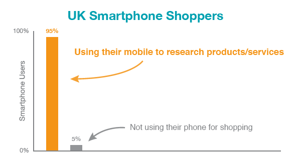
FACT #3: 95% of them use their phone to research a product or service they plan on buying.
Still think your business can live without mobile?
Source: Google, May 2012
Most Phones Are Now Smart
In just the last 12 months, smartphone penetration in the UK has risen from 30% to 51%. Today, smartphones are the norm.
According to Google / Ipsos OTX Media CT research (May 2012), 59% of smartphone owners are now accessing the internet from their mobile phones on a daily basis, with around a third of users actually completing purchases on their mobile. And these figures are still growing quickly.
It’s no surprise therefore, that UK businesses have woken up to the mobile opportunity and investing in mobile-optimised websites to ensure their customers can interact with their business easily from a mobile device. However, the user experience on many mobile websites is far from perfect.
At the end of this article we present 8 ways to improve your mobile website’s conversion rate. We’ve highlighted some of the biggest mistakes businesses are making with their mobile websites that are guaranteed to stop customers making a purchase on their mobile, and force others to completely give up using some websites at all.
But first, let’s look at the buying cycle and see how mobile users fit into the buying process.
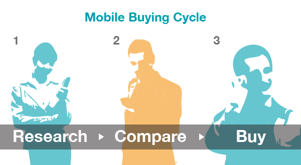
The Mobile Buying Cycle
Whenever anyone wants to buy something, they enter a buying cycle that in very simple terms consists of three stages:
- Research possible products/services and the available options
- Compare suppliers of the desired product
- Buy
eBay has a great mobile website and mobile app. Their users feel comfortable carrying out the full buying cycle on their mobile device. Millions of them do this every day. For many businesses however, focusing on allowing their customers to complete the whole buying process may not be worth the effort. Instead, the focus must be on delivering the content that the mobile user needs to help them progress through just one or two of the buying stages, most likely the research and comparison stages.
Some mobile sites are quite capable of delivering all three stages. Others shouldn’t even try. Not every product can or should be purchased on a mobile phone.
Considering where in the buying cycle your mobile users are placed can be helpful in planning what content to give them.
Testing Your Mobile Site
Before getting into the techniques for increasing your mobile conversion, it’s important to note that the only way to tick off any of the below items as ‘complete’ is to check them on several mobile phones. Don’t just check your site on your iPhone and assume everything will be ok for BlackBerry, Android and Windows Phone users. Be aware that different phones bring with them unique challenges that can completely change the user experience.
For example, iPhones have large, bright touch-screens, but no physical keyboard. Android phones come in many different flavours; some with quite small screens, and many have a mixture of physical and virtual buttons. BlackBerry devices tend to have physical keyboards for easy text entry, but many have small non-touch-screens with buttons or wheels to scroll up and down and offer a very different experience to Android and iPhone.
Don’t be fooled into thinking the way your website works on one device will be the same for everyone. The mobile space is complicated with many different devices available. Testing on a range of devices is crucial, which is why here at Tecmark we have a test device cupboard jam-packed with mobile phones and tablets ranging from the first iPhone through to the latest Android and Nokia Windows Phone devices.
8 Ways To Improve Your Mobile Conversion Rate
- Minimise Distractions. During the mobile experience your customers may receive text messages, phone calls, Facebook updates and countless other notifications and messages from their apps. Your user experience must be fast, slick and straight to the point. Put your primary content at the top of the page and move everything else out of your users’ way.
- Minimise Input. Mobile users don’t take kindly to filling in forms and complicated search boxes. They don’t like having to select from a multitude of choices. They especially despise having to input the same information more than once. Yet, many sites force them to do these things, resulting in massive customer drop-off and low conversion. Ask mobile users only for the bare minimum information. Rather than asking them to enter their postcode or town to give them ‘near me’ results, use their GPS location to automatically and much more accurately gauge their proximity from your business locations.
- Big Buttons. Enable users to easily find and digest your main navigation menu, ensuring the links are easy to use, especially for touch-screen users. Make buttons BIG and with enough margin around them to tap with your thumb without feeling like you might accidentally tap something else by mistake. Ensure all text content is easy to read without zooming in.
- Telephone Numbers. Don’t display your telephone number like: +44 (0)20 123 4567 – many phones will automatically recognise a telephone number and give users the ability to call by tapping the number. In this example the “+44 (0)” part may cause a problem, either stick to +44 or 0, not both.
- Intelligent Forms. Where a user input form is absolutely necessary, make use of HTML5 form input fields to ensure users get the best user experience. For a “name” field the normal keyboard will appear. For a “telephone” field, the numeric keyboard will appear automatically.
- One Experience. Giving your customers a single, connected user experience across all their devices is one way to make them feel in control and able to trust your online business. Something they start on their mobile should be saved so that if they wish they can continue on their laptop later on, and vice versa. Wish lists, shopping carts, favourites and other dynamic user-centric content should follow your customers no matter how they access your website.
- Offline Conversions. Where appropriate, offer your users an easy way of finding your nearest store or contact details, rather than expecting them to complete the entire buying cycle on their mobile.
- Avoid Flash like the plague. It doesn’t work at all on Apple devices, and it’s not exactly great on Android devices. In my opinion, Flash is dead. Chances are, whatever you’re doing in Flash can be done more elegantly in HTML and JavaScript, which will work on all modern devices.


Leave a comment
No Comments